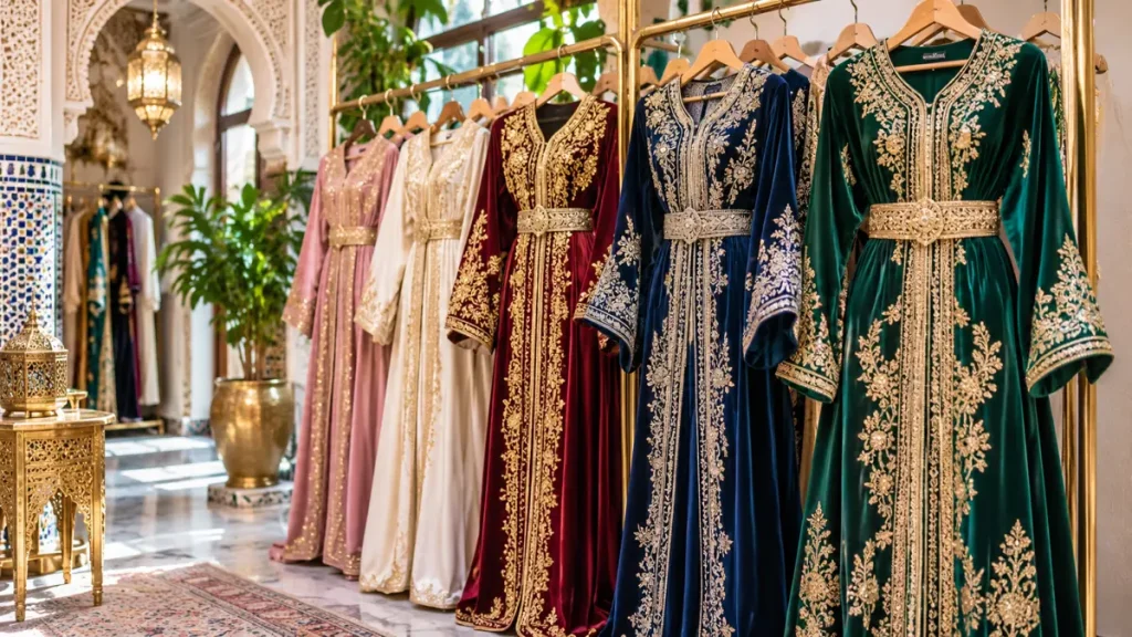
Colour is often the first feature noticed in a Moroccan caftan, yet it is also one of the easiest to judge too quickly. A shade that looks perfect on a product page may change under warm event lighting or beside metallic embroidery.
The useful question is not simply which colour is fashionable. It is which palette supports your complexion, occasion and the garment’s decorative structure.
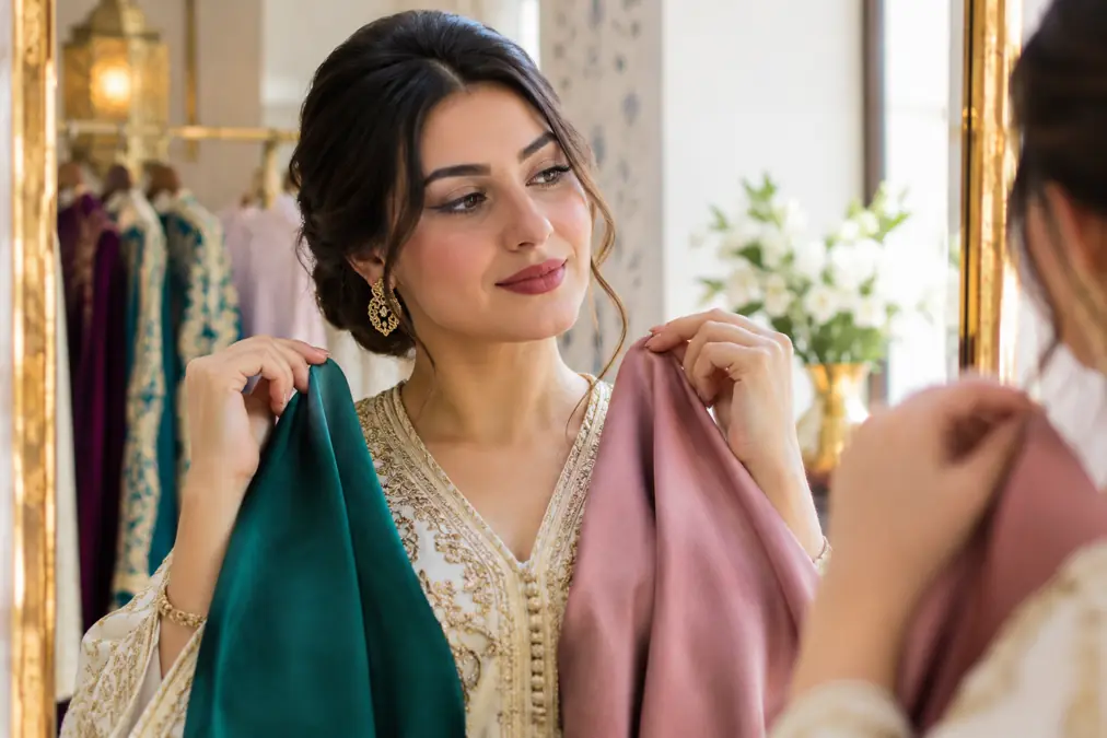
Start with light, not labels
Descriptions such as emerald, sage or champagne can cover many shades. Look at the garment in daylight, warm indoor light and flash photography when possible.
Screens also vary. If exact colour matters, request an unedited daylight image or a fabric sample rather than relying on one polished photograph.
Use complexion as guidance, not a rule
Hold fabric near the face and notice whether the skin appears clearer or more shadowed. Warm undertones often work beautifully with gold, olive, rust and warm jewel tones, while cool undertones may respond to silver, blue, berry and icy shades.
These are starting points, not restrictions. Contrast, makeup, hair and personal preference can make an unexpected colour successful.
Match colour to the event
Soft blue, blush, mint and ivory can feel fresh for daytime events. Navy, forest green, burgundy, plum and black gain depth in evening settings.
Role matters too. A guest may prefer a refined palette that does not compete with the central celebration, while the guest of honour can choose stronger contrast.
Consider season and temperature
Colour creates a visual sense of weight. Deep velvet in burgundy feels naturally suited to a cool evening; light crepe in dusty blue suggests ease in warmer weather.
Fabric matters as much as hue. The same green can appear dense in velvet and luminous in satin.
Coordinate embroidery metal
Gold embroidery warms a palette and creates strong contrast on dark colours. Silver can sharpen cool tones, while tone-on-tone work produces a quieter, more modern surface.
Do not evaluate the base colour separately from the decoration. A beautiful shade can lose its character when the metallic tone dominates it.
Work with more than one colour
Two-colour caftans benefit from hierarchy. Decide which colour leads and which one frames panels, sleeves or lining.
Equal amounts of two strong colours can feel busy unless the cut organizes them clearly. Repeating one tone in the belt or embroidery helps the composition feel intentional.
Think about photographs
Very pale colours can lose detail under bright flash, while very dark colours may hide embroidery in low light. Texture and metallic thread help preserve definition.
Take a phone photograph in lighting similar to the venue. It is a simple way to see whether the dress remains readable on camera.
Build the rest of the outfit afterward
Once the caftan palette is decided, choose shoes, bag and jewelry. Matching everything exactly can make the look flat; controlled variation usually feels richer.
A neutral bag, metallic shoe or accessory that repeats a secondary embroidery tone can connect the outfit without turning it into one block of colour.
Final Thoughts
The right palette is the one that remains flattering in the actual setting and gives the craftsmanship enough contrast to be seen.
Test colour near the face, under realistic light and beside the embroidery. That process is more reliable than choosing by trend name alone.